Anesha-Santhanam-Portfolio
| HOME | IN-CLASS EXERCISES | WORKBOOK EXERCISES | VISUALIZING GOVERNMENT DEBT | CRITIQUE BY DESIGN | FINAL PROJECT PART 1 | FINAL PROJECT PART 2 | FINAL PROJECT PART 3 |
Visualizing Government Debt Using Tableau
Visualizaion 1
Below is the original visualization of government debt.
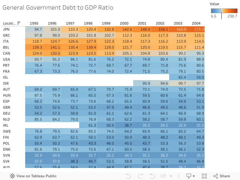
Visualization 2
Below is a Tableau-created visualization using a heatmap.
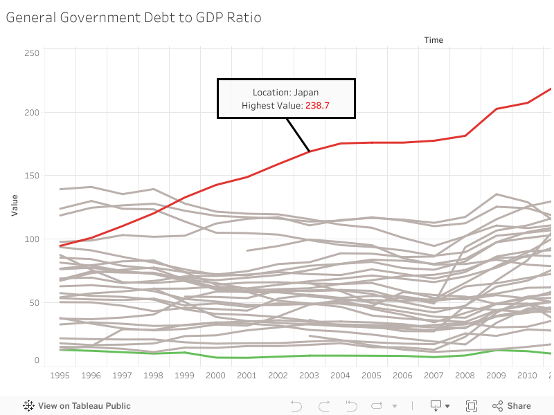
Visualization 3
Below is a Tableau-created visualization using a line graph.
Visualizing Government Debt Using Tableau - Analysis
The different methods of visualization of the government debt to GDP ratio for multiple countries provide three different approaches and stories to the data, and in my opinion the best visualization is the third (my own) one. The first is a bar chart, which attempts to tell the story that Japan’s % of GDP is the highest out of all of the other countries in the chart. Similarly, the heat map also tells the story that Japan’s government debt to GDP ratio is relatively high/the highest compared to the other countries. The third visualization which I created also tells the story that Japan’s government debt to GDP ratio is the highest out of the other countries, and that Estonia’s government debt to GDP ratio is the lowest out of all of the countries. All graphs use some form of ranking, where “an item’s position in an ordered list is important” (Visual Vocabulary). We can see Japan at the top or far left of the graph and Estonia at the bottom of the second and third graphs. The difference in the third visualization’s story of both the highest and lowest values helps to add understanding to the graphs.
There are some improvements that can be made to the first and second visualizations that I have represented in the differences made in the third visualization. The first visualization is a bar chart where the highest bar represents the highest ratio, which Japan has. A major issue with this chart is the coloring. Two bars are highlighted in light blue while the rest are in dark blue, and the highlighted bars add no meaning to the graph as they are not significant. Additionally, not all countries are labeled next to their respective bars. Only a few countries are labeled, so the reader does not know which countries the unlabeled bars represent. Lastly, there isn’t a clear story. We see a possible maximum with Japan’s bar, but nothing to highlight whether it is significant, good or bad. Regarding the second visualization, we see that the color scheme changes regarding the value. Higher values are darker and more orange, and lower values are more blue. The colors do not clearly indicate the story of whether high values are good/bad, but they do signify higher and lower values with darkness/color changes. However, the graph is quite cluttered and at first glance, it is difficult for the reader to identify what the graph is pointing out other than just stating values.
In my third visualization, I made sure to create a story where the reader can look at the graph for a few seconds and get a good idea of what is happening. The most important thing I wanted to achieve with the graph was give clarity of focus by “reducing cognitive load and focusing on what matters,” (“Six Principles for Designing Any Chart”) which was the high/low ratio. The first thing I did was modify the title to reflect the content of the graph. Then, I wanted to tell the story of the countries with the highest and lowest government debt to GDP ratio, and wanted to make it clear that a high ratio was not good for the economy of the country. Therefore, I created a line graph with multiple lines to show the trajectory for each country, and colored all lines grey except Japan (highest ratio) which I colored red to indicate a bad ratio, and Estonia (lowest ratio) which I colored green to indicate a good ratio. This made the storytelling clear to show the trajectory over the years while clearly showing which countries have the best and worst ratios.